ROLE: Concept, art direction, graphic design.
CLIENT: Yess
Media and Solar Profit.
TEAM: Creative Direction:
Titi Mas-Bagá (copy),
Creative:
Cami Montaldo. Production:
Alex Gargot. Production:
Grayskull. Photography:
Juan Cruz Duran. Photo
post-production: Ruben Tresserras.
SOLAR PROFIT
BRAND CAMPAIGN
TV
commercial, digital, promos, graphics
In 2022, Solar Profit went public and wanted to create a powerful
communication campaign that would generate awareness and have a
significant impact on the national market. They aimed to convey a
message about positive change in self-consumption energy, towards a
better, cleaner future, towards a more sustainable tomorrow with a
more sustainable bill.
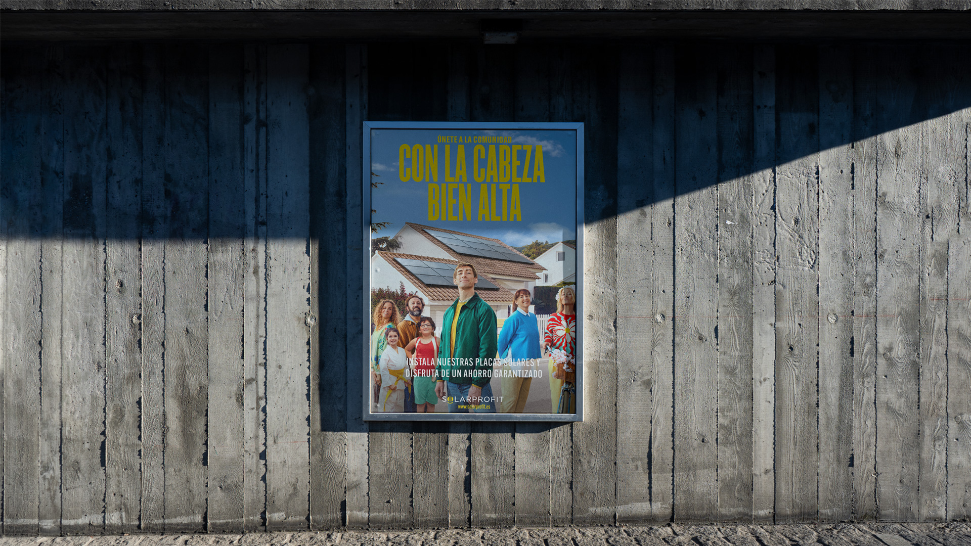
1. Capture of the Solar Profit advertisement.
2. Capture of the Solar Profit advertisement.
BRAND RATIONALE
Solar
Profit and pride
Solar Profit is a solar panel company: a highly regarded product.
Unlike other sectors, the solar panel industry is considered "good"
and necessary to save the planet. It is considered one of the
products of the future. Additionally, unlike other companies, Solar
Profit doesn't sell energy; it helps you create your own. This makes
it even more interesting.
Thanks to its growth and
experience, Solar Profit has become the number one company in the
sector. Solar Profit handles everything from design to installation
and monitoring. Ultimately, with all these attributes, if there's
one thing a person with Solar Profit solar panels can feel, it's
PRIDE.
CONCEPT
Hold their head
high
There are those who go through life: HOLD THEIR HEAD HIGH. This
wonderful feeling of overflowing pride, knowing that they are a
little more resourceful than others. That glorious satisfaction of
feeling freer than ever, knowing that they are not giving away their
money.
This absolute relaxation of not having to worry
about anything because they already have the best quality. Those who
go through life in this way have no doubt; they are in the hands of
those who know best. Welcome to the HOLD THEIR HEAD HIGH community.
(TV commercial copy).
3. TV commercial, 30-second version.
ART DIRECTION
Cinematic
style, colorful aesthetics
This intermediate point between reality and fiction
Both the commercial and the photographs had to have a cinematic,
colorful, and vibrant tone, matching the fun tone of the piece. It
will always be a sunny day, so the shadows of the characters will be
strong. We didn't want to exaggerate in any area: performance,
color, composition, retouching, etc. We had to find the right
balance between reality and fiction.
The Color
Color should take center stage. It's more vibrant than usual, but
it doesn't affect the entire scene. We prioritize the use of primary
colors, wanting to highlight the characters without disrupting the
harmony between the character and the background.
PHOTOGRAPHS AND GRAPHICS
Hold their head high
Characters
It was important
for our characters to exude that wonderful sense of overflowing
pride. Their faces and expressions had to reflect satisfaction,
freedom, and enthusiasm for life. How? HOLD THEIR HEAD HIGH and
their necks slightly stretched upwards.
Point of view
Each character had their own personality and unique style. They all
had to reflect that special and unique attitude. Capturing the
emotion was a key aspect in their faces. We aimed to work with
slightly low-angle shots to highlight and emphasize the characters'
proud attitude, always in the foreground. The product and the scene
were always just behind.
4. Campaign photographs.


5. Campaign description.